[Resource] The Prejudice Map

The Map
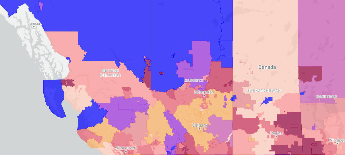
The Prejudice Map has been compiled to show areas of implicit and explicit bias across North America in a variety of key fields. This map shows where levels are higher or lower than average.
The Data
The data come from Project Implicit, a site people visit to learn more about their attitudes. We visualize two measures of bias: explicit and implicit.
Explicit bias is, for example, self-reporting on a survey that "I don't like XXX people."
Implicit bias, here from an "Implicit Association Test", is calculated from reaction time. For example, being faster to associate one group with "good" than "bad", compared to another group.
The Details
Data represent the attitudes of the majority group or "everyone else." This changes by type of bias. For example, anti-gay biases are the averaged attitudes of self-identified straight people. Some regions are not included, as the amount of data from that region was below a threshold (too few data points to be a reasonable estimate).
This map was created by Dr. Eric Hehman, a social scientist studying prejudice at McGill University.
Find more about his research here: erichehman.com; hehmanlab.org
-
By
Dr. Eric Hehman and Project Implicit
-
Published
Oct 02, 2024
-
Subject Area
- Age-friendly Communities
- Immigrants, Refugees, & Multicultural Seniors
- LGBTQIA2S+
- Non-profit / Charitable Sector Development
- Rural & Remote Communities
- Technology & Digital Literacy
- Health & Wellness - General
- Ageism
- Advocacy
- Best Practices
- Resources & Reports - Provincial
